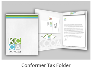
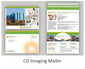
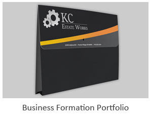
 Presenting information to a potential client or partner requires an effective design and strategy. A presentation folder is more than a simple way to carry information and materials. It is a subtle way to reinforce your brand name and build the image of your company.
Select the Right Type of Folder
The first part of building an effective presentation folder is the design of the folder. Simple folders are ideal for most professionals; however, certain businesses benefit from more interesting or eye-catching designs.
Factors to consider when selecting the type of presentation folder include:
- Your products and services
- The target audience
- Your message or messages on the folder
- Colors used on the folder
- Images
As a general rule, select a folder based on the target audience. For example, businesses working with children or targeting parents with young children may benefit from cartoon images, bright colors and curved or serpentine designs. Companies with a serious message may need a traditional presentation folder or a simple vertical folder. Focus on the goal of the folder and presentation when selecting the best option for the brand.
Use Images
The images you use on the presentation folder play a key role in the impact you make on your target audience. Build a folder with an image that appeals to your audience while also encouraging a specific idea. For example, a medical facility may use images of medical professionals or x-rays related to the areas of the body a doctor specializes in treating. Folders focused on services to children may benefit from cartoon images or bright colors that catch a child’s eyes and encourage them to point out the image to a parent.
Select images based on brand development and company goals. Focus on images that create a clear picture in a client’s mind about your services.
Keep Wording Concise
Using a statement or a set of words on a presentation folder may improve or hinder your goals. Focus on concise and clear wording. Use phrases with reasonably large print or use bullet points to send a clear message. Limit words and phrases for a larger impact on your target audience.
Building an effective presentation folder depends on your goals as a business owner. Focusing on simple designs, concise wording and clear imagery provides an opportunity to encourage potential clients to look into the company and consider working with your brand.


 Presenting information to a potential client or partner requires an effective design and strategy. A presentation folder is more than a simple way to carry information and materials. It is a subtle way to reinforce your brand name and build the image of your company.